In this post we will go through some simple analysis of LC-MS/MS data as that is one of the more common methods used in our field and the concepts are largely transferable to other types of MS data.
The point of this post is less about teaching R or certain packages (we may do deep-dives using other languages and packages in the future) and more about exposing readers to concepts and how to think about the underlying data.
The sample is a Micromonospora extract. The extraction was performed from a bacterial culture growing on solid A1 agar media following the protocol of Bligh,E. G. and Dyer, W. J. (9). Agar cultures were divided into 1 cm3 pieces and 3 mm glass beads were added. Extraction solvent was added in three steps with vigorous vortexing between steps 1) 1:2 (v/v) CHCl3:MeOH, 2) CHCl3 in 1/3 the added volume of step one, 3) H2O in 1/3 the added volume of step one. From the resulting two-layer liquid partition, the organic layer was retained for further analysis.
The extract was analyzed via LC-MS/MS with a method adapted from that described by Goering et al. Experiments were performed on an Agilent 1200 workstation connected to a Thermo Fisher Scientific Q-Exactive mass spectrometer with an electrospray ionization source. Reversed-phase chromatography was performed by injection of 20 μL of 0.1 mg/mL of extract at a 0.3 mL/min flow rate across a Phenomenex Kinetex C18 RPLC column (150 mm x 2.1 mm i.d., 2 μm particle size). Mobile phase A was water with 0.1% formic acid and mobile phase B was acetonitrile with 0.1% formic acid. Mobile phase B was held at 15% for 1 minute, then adjusted to 95% over 12 minutes, where it was held for 2 minutes, and the system re-equilibrated for 5 minutes. The mass spectrometry parameters were as follows: scan range 200-2000 m/z, resolution 35,000, scan rate ~3.7 per second. Data were gathered in profile and the top 5 most intense peaks in each full spectrum were targeted for fragmentation that employed a collision energy setting of 25 eV for Higher-energy Collisional Dissociation (HCD) and isolation window of 2.0 m/z.
The mzXML file was created with ProteoWizard’s msconvert, using default settings.
Set up an 🇷 session
The rest of this tutorial will take place using R.
Here we will install and then load mzR, a Bioconductor package for parsing mass spectrometry data. Vignette here. For plotting we’ll be using ggplot2 and plotly.
The following object is masked from 'package:ggplot2':

    last_plot
The following object is masked from 'package:stats':

    filter
The following object is masked from 'package:graphics':

    layout
if (!require("data.table", quietly =TRUE)){install.packages("data.table")}library(mzR)library(ggplot2)library(plotly)library(data.table)
Download the data
Next let’s download the LC-MS/MS data we will be working with to a temporary directory (i.e. the directory will be deleted upon closing the R session).
There are two files:
an mzXML file which contains centroid data (peaks only)
an mzML file which contains profile data (raw data,not peak-picked)
GNPS used to require mzXML so that’s the reason for both mzXML and mzML formats.
Warning: This is a 22 MB and 306 MB download.
# I have slow internet so I'll increase the amount of time the download is allowed to takeoptions(timeout=240)temporary_directory <-tempdir()# 22.3 MBpeaks_file_path <-file.path(temporary_directory, "B022.mzXML" )download.file(url ="ftp://massive.ucsd.edu/v01/MSV000081555/peak/B022.mzXML",destfile = peaks_file_path)# 306.1 MBraw_mzml_path <-file.path(temporary_directory, "B022.mzML" )download.file(url ="ftp://massive.ucsd.edu/v01/MSV000081555/raw/FullSpectra-mzML/B022_GenbankAccession-KY858245.mzML",destfile = raw_mzml_path)
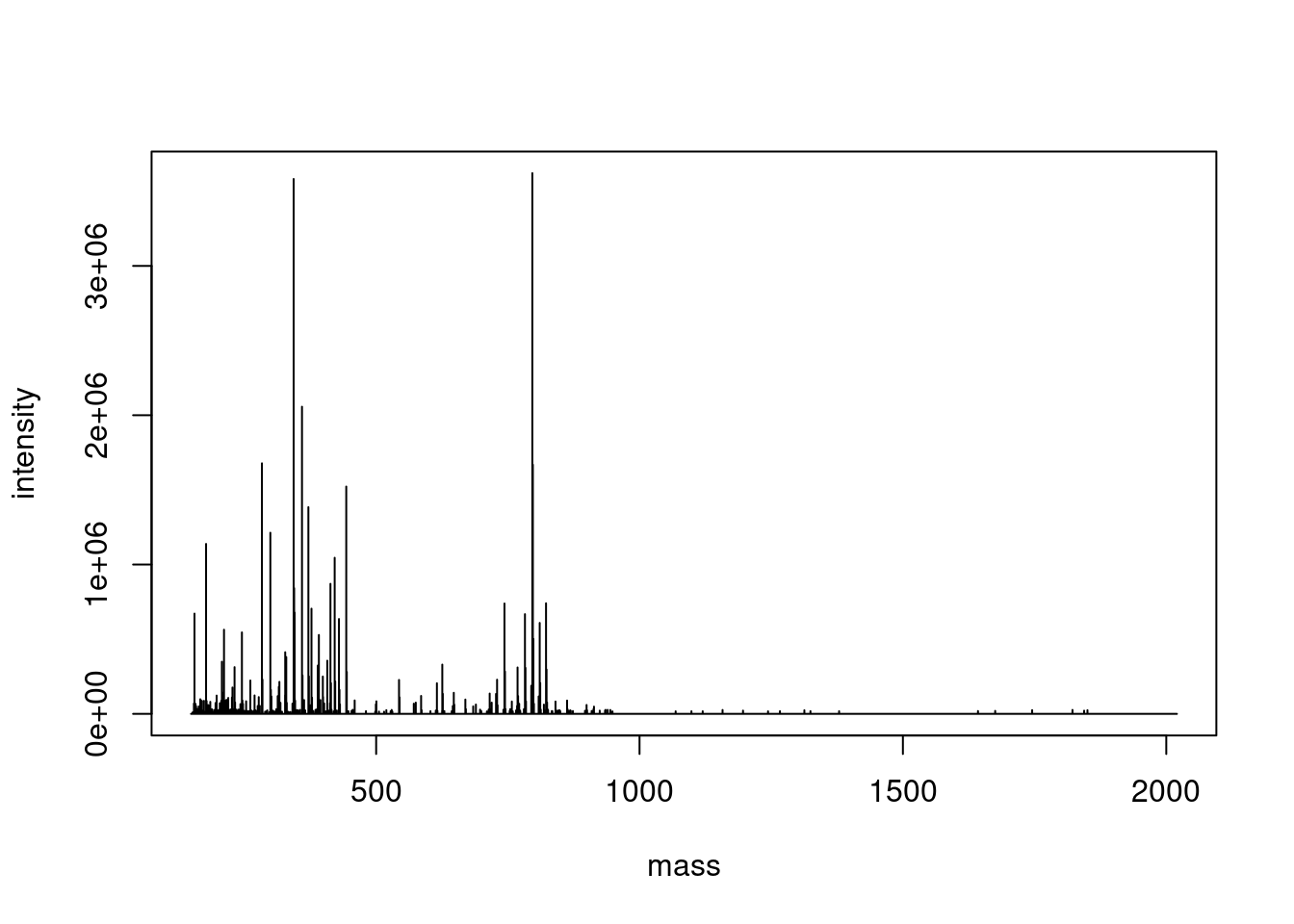
To start off we’ll inspect scan 2242 which is the MS1 scan that contains the precursor for the MS2 scan “2243” which appeared in Figure S6F and corresponds to a C14 acyl-desferrioxamine.
Based on the header table this should now be a two-column matrix containing 7076 rows.
head(single_spectrum, 5)
dim(single_spectrum)
[1] 7076 2
Plot a profile spectrum
The two-column matrix can be passed directly to R’s base plotting function, with the additional argument type="l" which stands for “line”.
plot( single_spectrum,type ="l",)
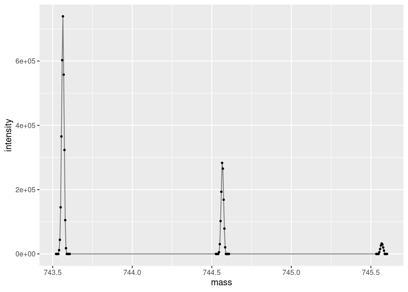
Plot an isotopic envelope
Let’s zoom in on the 13C isotopic envelope of the “743.5622 m/z” precursor we are interested in. Note that R/code doesn’t have a concept of “zoom”, we just filter the data for the the area of interest and only plot that filtered data. Here we filter the data to only include rows where the mass column is greater than 743 and less than 750.
ggplot(data =subset(single_spectrum, mass >743& mass <750),aes(x = mass, y = intensity )) +geom_line(color="gray48") +geom_point(size =0.75, color="gray0")
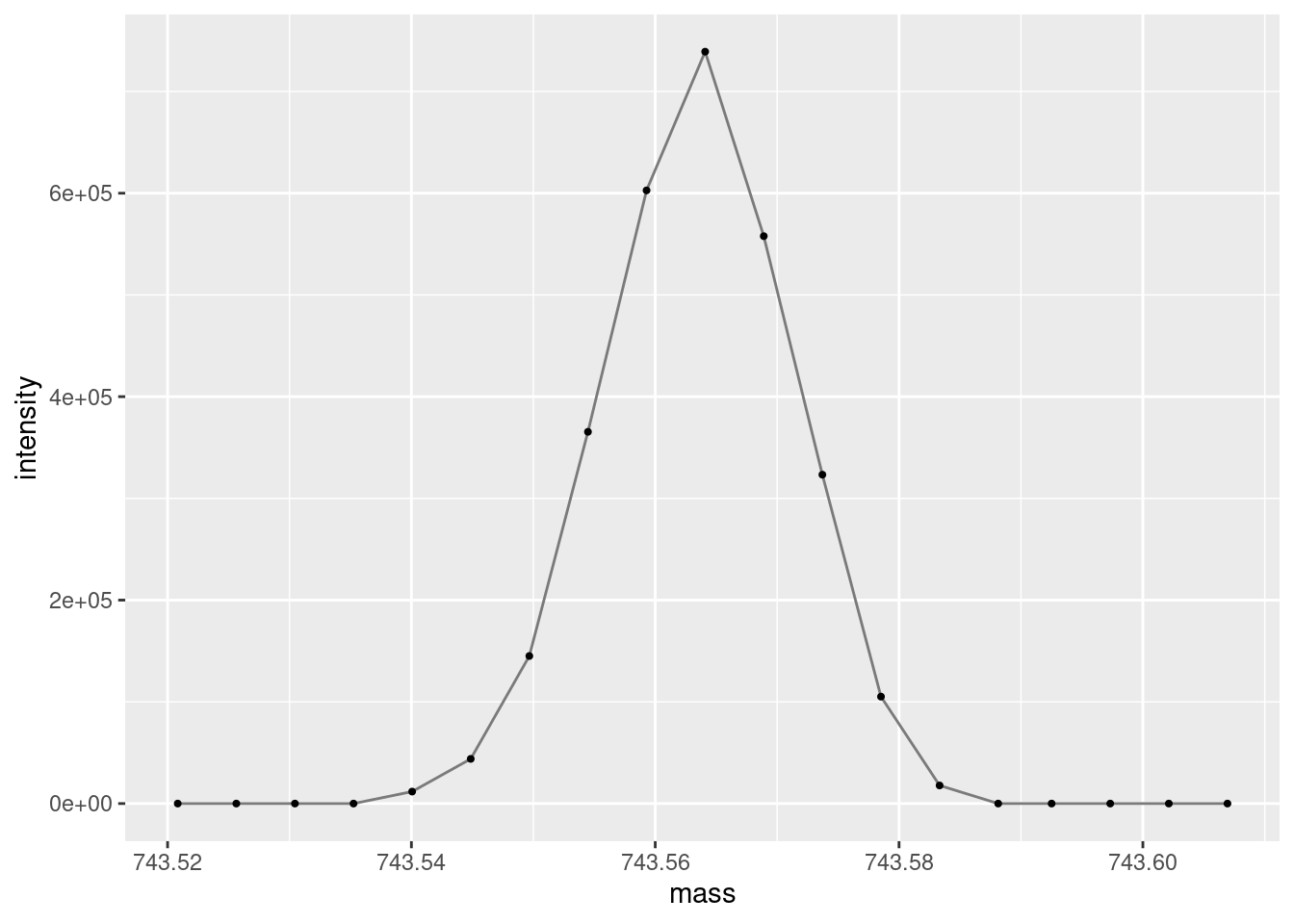
And now zoom in further, to the monoisotopic peak.
ggplot(data =subset(single_spectrum, mass >743& mass <744),aes(x = mass, y = intensity )) +geom_line(color="gray48") +geom_point(size =0.75, color="gray0")
An important thing to take note of when doing most types of spectroscopy/spectrometry is the number of measurements across a peak. Here we are getting ~10 data points per ion/peak which is pretty good. The smaller the number of points, the worse your peak shape will be, the worse your accuracy and precision will be. Alternately, too many points can bloat your data size and sometimes make analyses more difficult. Additionally, more data points collected per scan can decrease the number of scans you can collect per unit of time. This is largely controlled by dwell time in the MS acquisition settings.
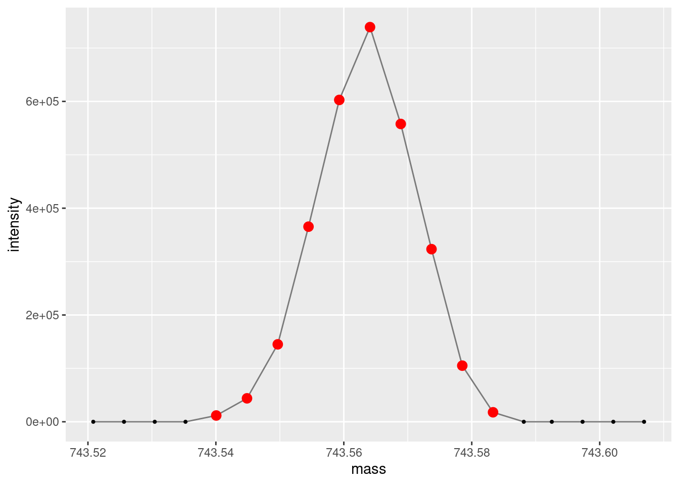
ggplot(data =subset(single_spectrum, mass >743& mass <744),aes(x = mass, y = intensity )) +geom_line(color="gray48") +geom_point(size =0.75, color="gray0") +geom_point(data =subset(subset(single_spectrum, mass >743& mass <744), intensity >100),aes(x = mass, y = intensity ), size =3, color="red")
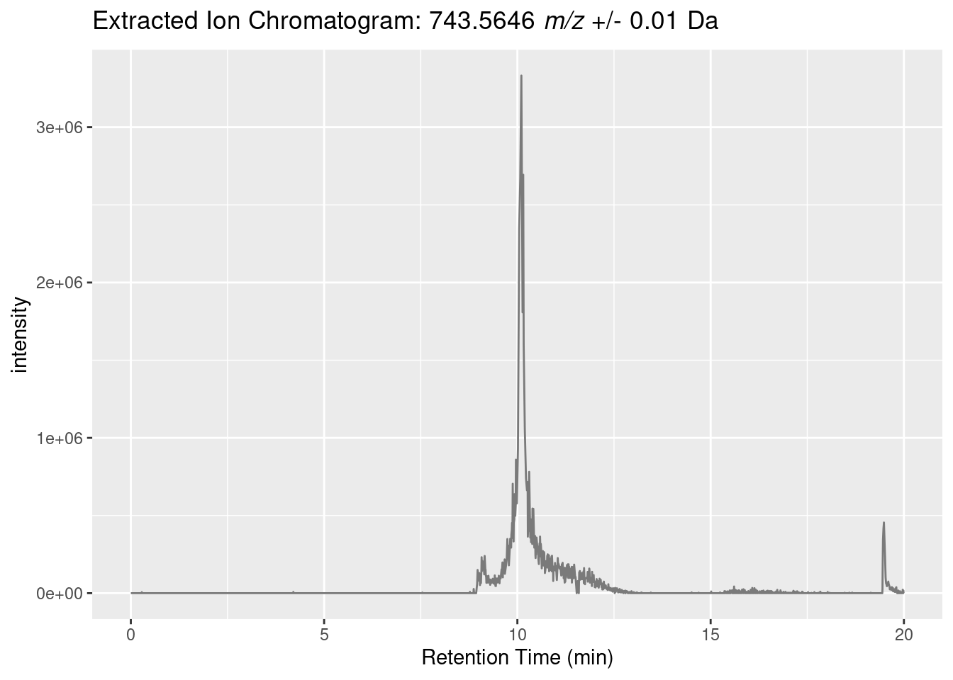
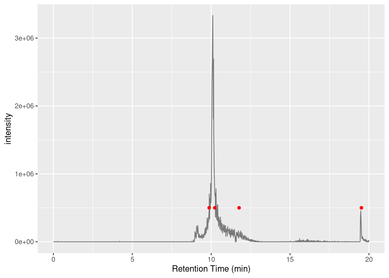
Plot an extracted ion chromatogram (EIC)
Let’s create a extracted ion chromatogram (EIC) for the “743.5622 m/z” precursor.
To do that we need to loop through all the MS1 spectra and extract the intensity (in this case the max) of data points within an m/z range.
full_spectra_header <-header(profile_spectra_handle)ms1_indices <- full_spectra_header[full_spectra_header$msLevel ==1, ]$seqNumtarget_mass <-743.5646delta <-0.01left_window <- target_mass - deltaright_window <- target_mass + delta# The lapply below creates a list of two-column data frames for each scan, like:# ret_time intensity# 1163.068 0list_of_data_frames <-lapply(ms1_indices, function(x){ ret_time <- full_spectra_header[x, ]$retentionTime x <- mzR::spectra(profile_spectra_handle, x) x <-as.data.frame(x)colnames(x) <-c("mass", "intensity") x <- x[x$mass > left_window & x$mass < right_window, ]if (nrow(x) >0){return(data.frame(list(ret_time=ret_time, intensity=max(x$intensity)))) } else {return(data.frame(list(ret_time=ret_time, intensity=0))) } })# concatenate all the data frames together into a single data frameeic_df <-do.call("rbind", list_of_data_frames)remove(list_of_data_frames)
Another consideration for the experimentalist (and a good exam question 😛 ) is how you could obtain more scans of this 743.5622 m/z target ion. There’s multiple ways, with the most obvious being to run in targeted mode where you only fragment parent molecules within a tight range around 743.5622 m/z. But if you need untargeted MS you can mess with duty cycles, or adjust your chromatography to increase the elution peak width of the target compound; sometimes 5 minute chromatography isn’t the best chromatography for the job.
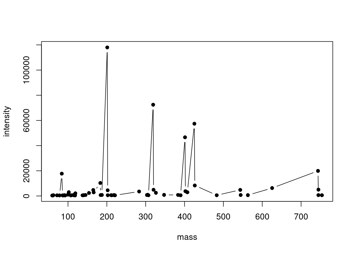
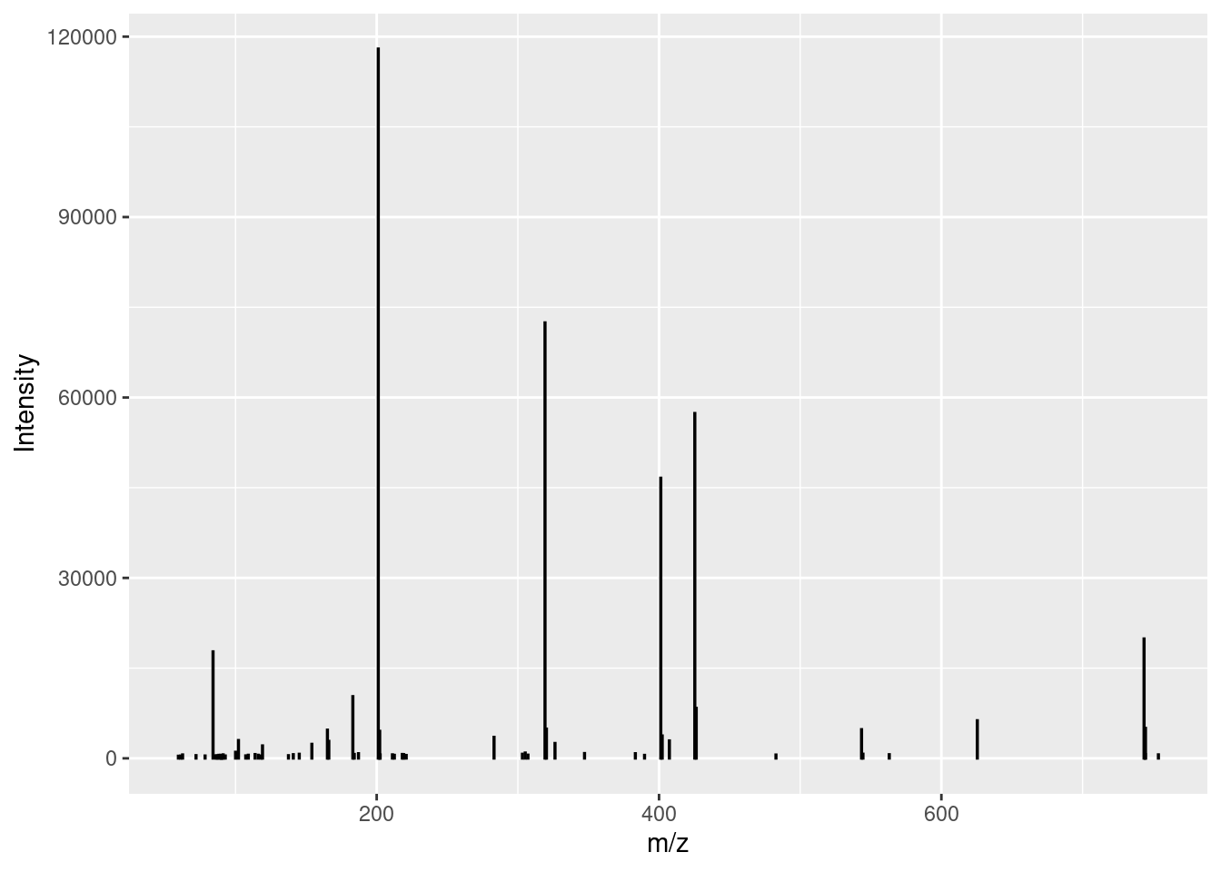
Plot a centroid spectrum
A centroid spectrum is a bit harder to plot than profile because a simple line won’t work. For example, look at this ugly mess (circles represent the data points):
One important step that I haven’t discussed yet is normalizing intensity values. This is especially important when comparing data from different sources, where intensity levels may be drastically different. For example, if we just plot our spectrum (positive) against the GNPS library spectrum (negative), we get this:
ggplotly(centroid_plot(df, gnps_spectrum_df))
But if we normalize the intensity values of both spectra to a scale of 0 to 100 then we get a useful representation.